
Coca-Cola
SERVICES:
Campaign Identity, Creative Direction, Logo Design, Environmental Design
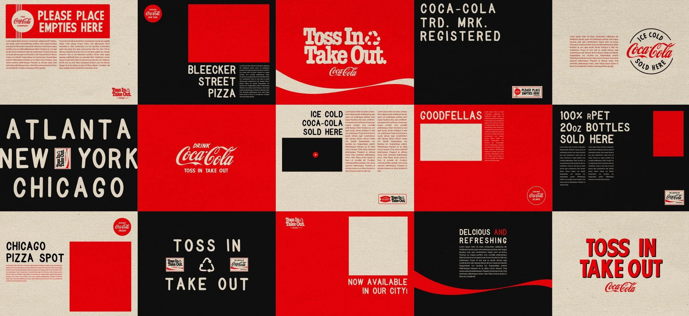
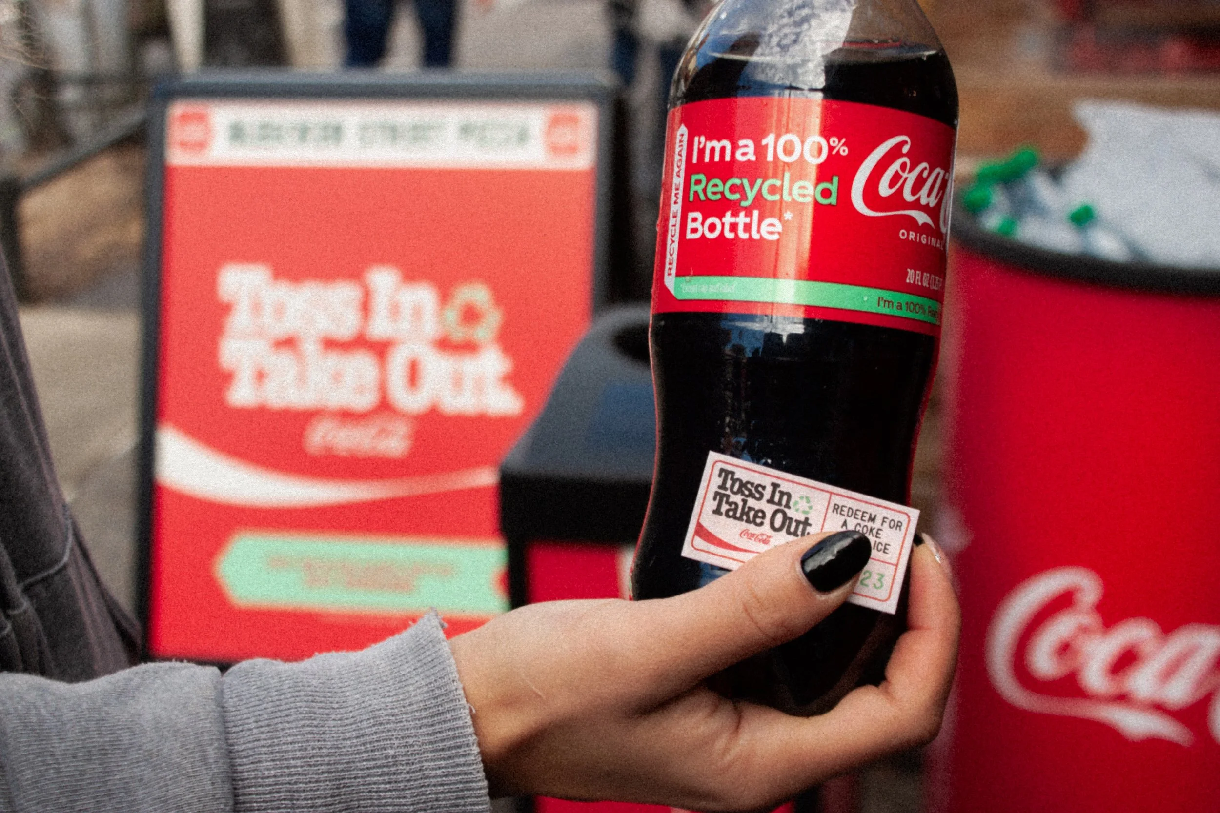
Toss In Take Out was created to celebrate the expansion of 100% rPET across key cities. To mark the occasion, Coca-Cola made plastic bottles the only acceptable form of currency at your favorite food joint. They partnered with beloved eateries in NYC, Chicago, and Atlanta—and for one day—allowed folks to pay for eats with a recycled bottle. This spotlighted the local markets while creating a national story through scale. We needed an identity that could both function and present authentically—while unifying these three distinct restaurants under the Coca-Cola brand.

READING ALL THE SIGNS
There was a noticeable presence of Coke brand ephemora at all these shops. So we decided to create our own versions of iconic coke restaurant signage. This would allow us to fluidly communicate in a simple & recognizable way. We would also be able to maintain a cohesive, authentic visual aesthetic. We borrowed design inspiration from the vintage logos, graphics, and typography often found in classic, local restaurants. Those no-frill diners, pizzerias, and counter-service joints with menu boards and bold, hand-lettered signage. There’s an unexpected clarity among the chaos of all that messaging.


REFRESHING THE CLASSICS
To compliment the ever iconic Coca-Cola red, we developed a palette that includes a faded black and a vintage-y, off white. This is to emulate the well-worn brand ephemora we’re paying homage to. It helps warm up the identity a bit, making it feel more welcoming and a bit lived in. We then brought in a dash of Georgia Green to drive home the recycled materials messaging.

SHOP LOCAL. TALK LOCAL.
We developed a visual vocabulary—a mix of graphics and badges that speak to different aspects or experiences of the brand. This approach provides us with a plethora of visual assets that help us tell the campaign story in a unique and detailed way. The visual vocabulary, like all design, is ultimatley about clarity of communciation. And this bespoke technique allows us to breathe life into a brand so that it feels more personable. Our visual language informs how the brand carries itself—how it looks and feels, how it walks and talks.

MENU BOARD SANS
To create this identity, we relied heavily on type, drawing inspiration largely from menu boards found at all these classic, local spots. Using that reference, we custom built a responsive typeface specially for this campaign to mimic the look & feel of press letter boards. Each glyph has multiple variations, which are automatically randomized when typing. This gives the font an authentic hand-set effect.


Commissioned by M&C Saatchi Sport & Entertainment. © The Coca-Cola Company.