Devinyl Splits, Vol. 2
SERVICES:
Art Direction, Visual ID, Design, Packaging, Admat
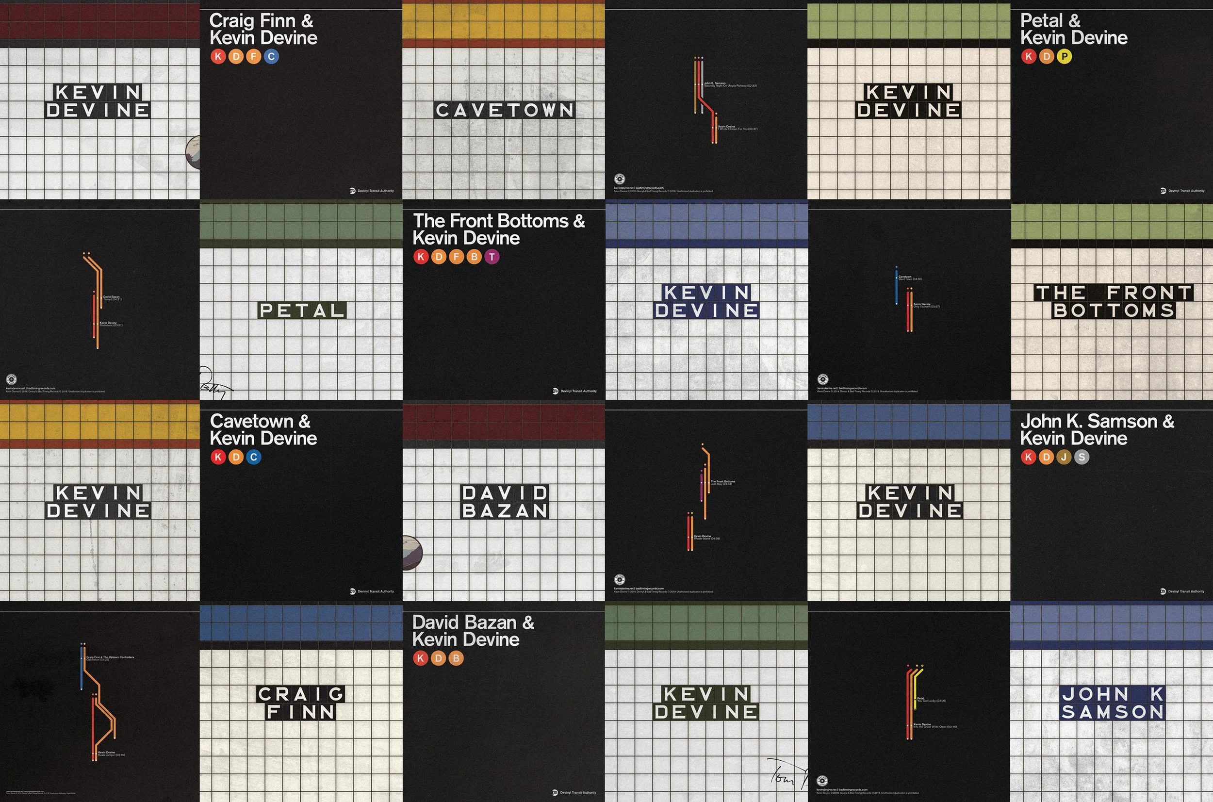
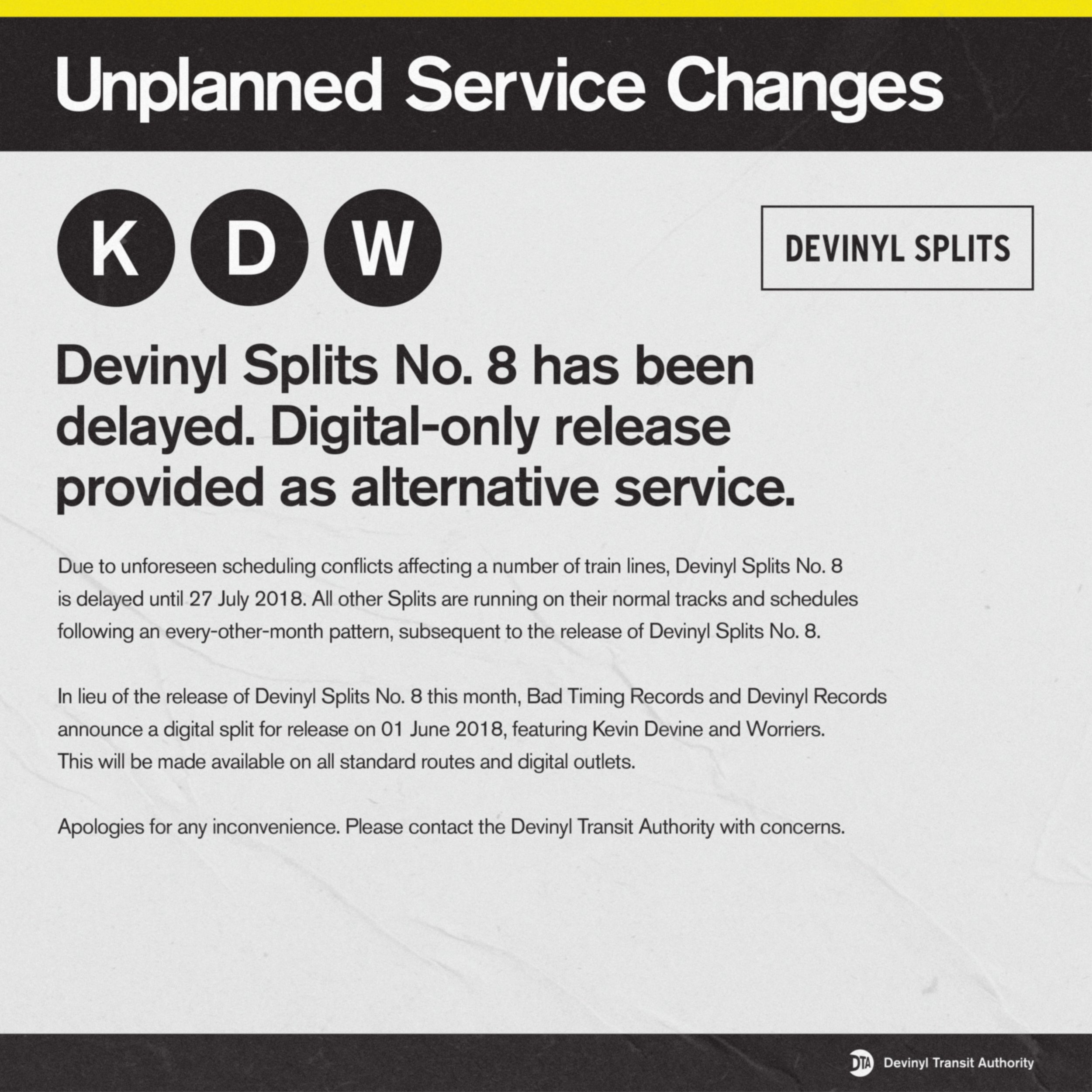
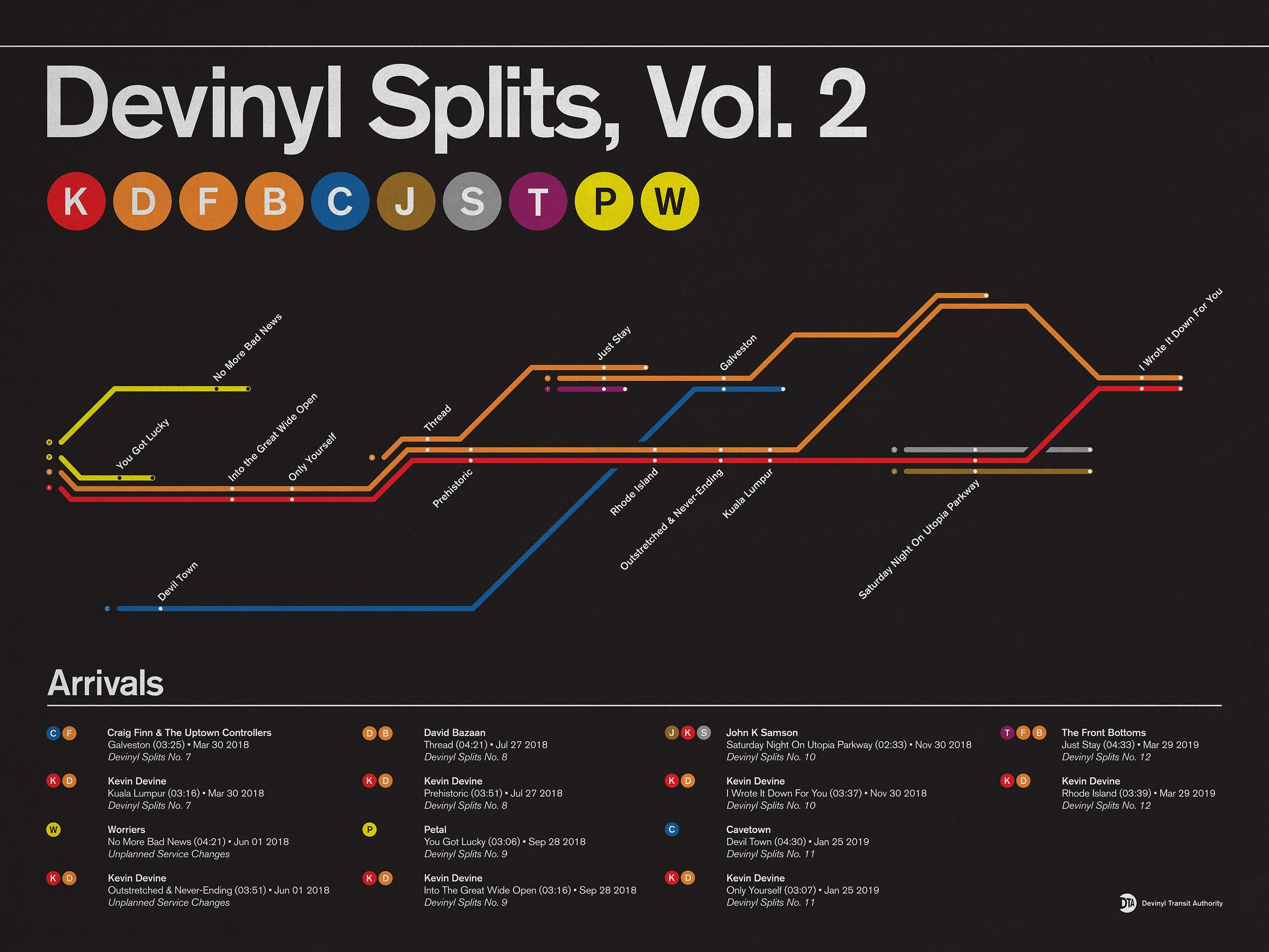
Over the course of 2018, Kevin Devine planned to put out a series of music, entitled Devinyl Splits. The series would consist of six 7-inch albums; Each album would be a “split,” meaning one side would feature a song by him and the other side would feature a song by another artist. Each of the six albums in the series would feature a different artist—so in total, twelve songs over the course of six releases with six unique artists. The artwork needed to have a consistent look throughout the series and Kevin Devine, being a native New Yorker, wanted the art to have a distinctively New York vibe that felt authentic.
REDEFINING THE SYSTEM
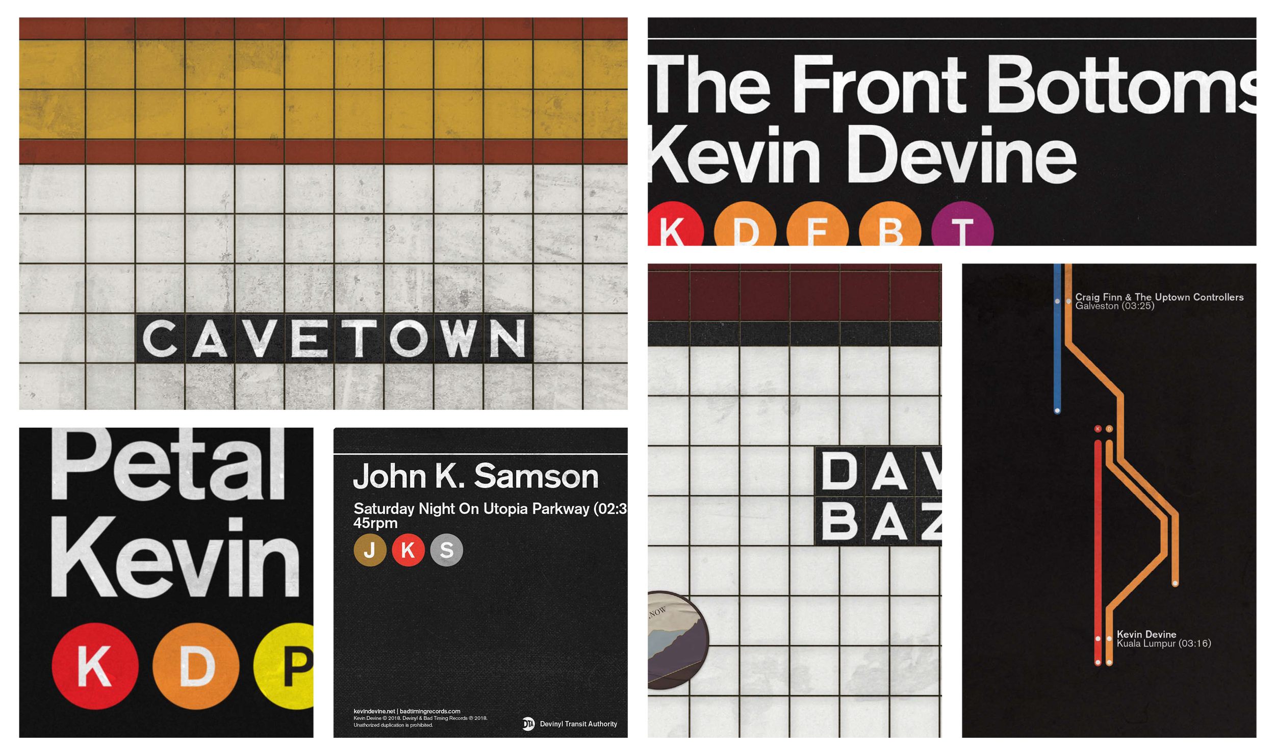
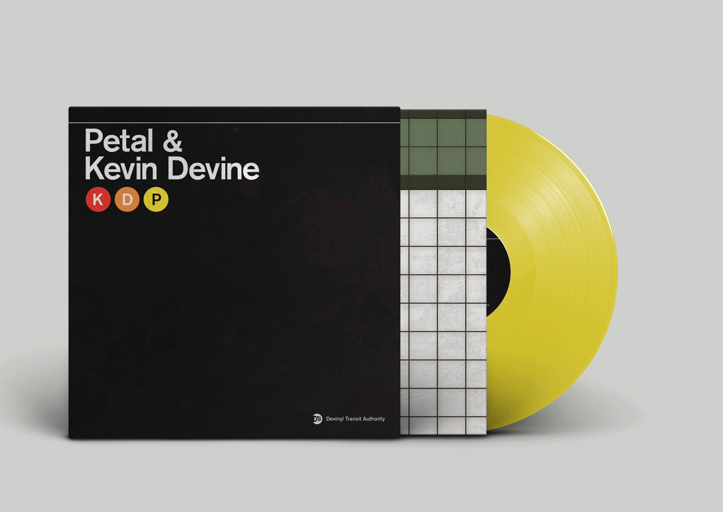
It was decided the best approach for handling the fluidity of the collaborating artists would be to develop an MTA-inspired subway system for the series. This gave the art a distinctively New York feel with an iconic visual identity. The design system then allows for an injection of playfulness, using various design elements that would enrich the story being told. For example, the initials of each artist were built into Subway lines and the stops on any given line denoted the song titles.


MAPPING THINGS OUT
A framework was designed to bring the concept to life in a fresh yet recognizable way. Record jackets were designed to be reminicent of MTA signage and the record sleeves were designed to look like the tiled walls visible from subway platforms. Grids were developed for both to ensure consistency across each release. To give the artwork more of an authentic feel and sense of surrealism, each record sleeve featured a different tile colorway. Additionally, unique gritty textures pulled from subway stations were added to each jacket and sleeve.
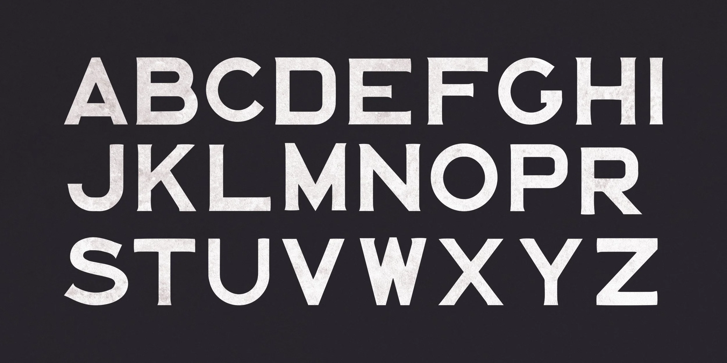
PROTYPICAL TYPE & ICONIC ICONOGRAPHY
In terms of typography, Akzidenz Grotesk (aka Standard Grotesk) was used for signage throughout the art—as it was the original typeface used in the 1960s Subway system before everything switched to Helvetica. Custom letters were traced and scanned to create the type for the subway tiles. Additionally, line icons were created and a Transit Authority parody logo was developed.