
Reebok
SERVICES:
Logo Design, Art Direction, Visual Identity, Copywriting & Brand Voice
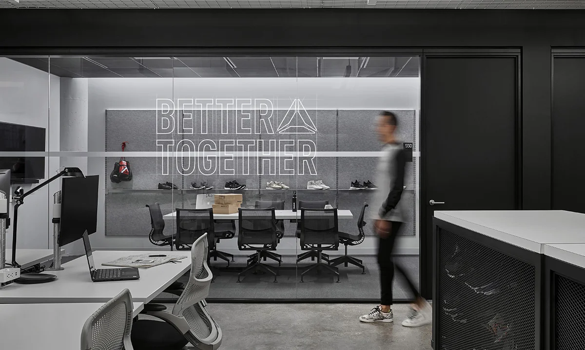
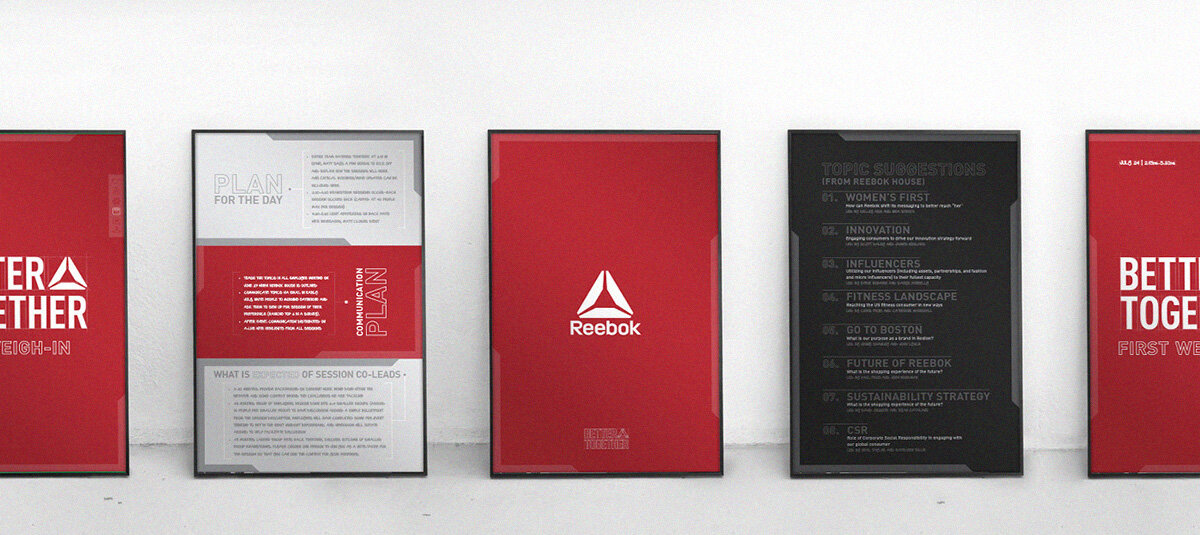
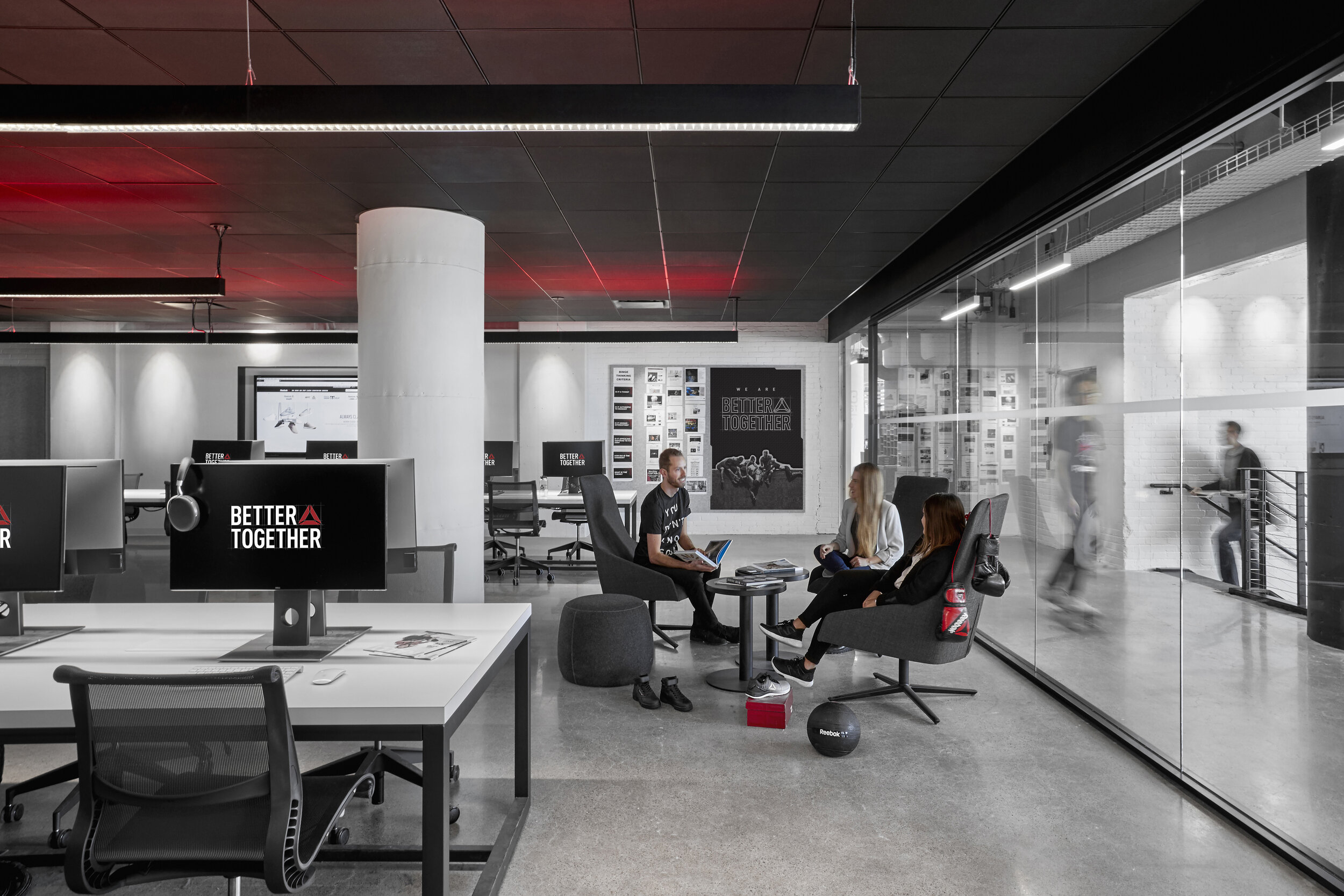
Based in Boston, Reebok had recently moved their headquarters to a new, state-of-the-art facility near the seaport. And with that, they wanted a fresh, internal-facing brand that could be used for corp comms in the new offices. Reebok asked for the internal brand, which was being called Better Together, to have a motivating & uplifting feel. The brand was supposed to mirror their consumer-facing campaign, Be More Human—but also have its own distinctiveness. Brand collateral consisted of everything from signage to newsletter emails to posters & flyers.

THE FOUNDATION
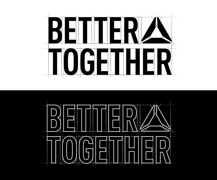
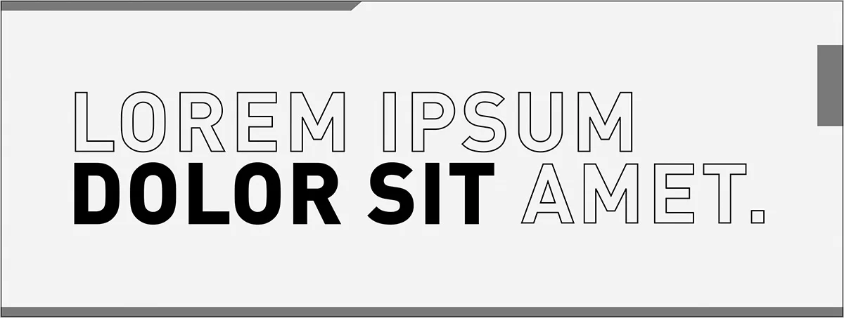
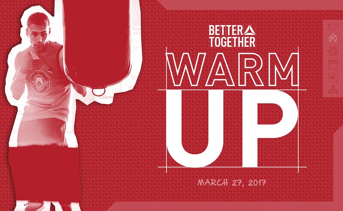
The consumer-facing brand was stripped down for a no-frills-behind-the-scenes type feel. A monochromatic palette. Grid patterns. Guide boxes. Outlined words and hand-written type.


WORK IN PROGRESS
Snapshot-esque borders, outlined & type, and design guidelines—combined with cutout-treated photography—create a work-in-progress aesthetic. Everything comes together visually to create an ever-sprawling drafting board; a never-ending blueprint. It’s planned and methodical yet evident that each piece of collateral is only one piece of the puzzle.


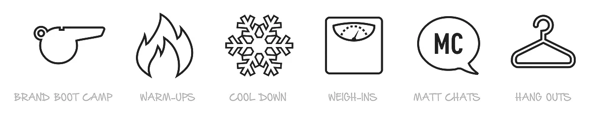

CATEGORICALLY SPEAKING
Every piece of collateral would be related to one of six brand initiatives. Icons were developed to represent these six categories. Visually, they were placed inside a holding tab, where the applicable icon was “activated.”

Commissioned by M&C Saatchi Sport & Entertainment. © Reebok International.